Inserting a chart

최근 업데이트 : Apr 30, 2015 |

Procedure

  1. Select Chart from the Insert menu.

    The first window of the Chart Assistant is displayed.

  2. From the Queries drop-down list, select the query from which you want to take data for the chart.
    Note:

    Any created queries that still include errors are unavailable.

    The Available Data box is populated with the data that was previously defined for the query.

  3. Use Add, Add all, Remove, and Remove All to add items from the Available Data box to the Data on Chart box and to remove items.

    For more information, see Add and remove items.

  4. Select Next.

    A Chart Assistant window is displayed.

    To change any of the options you select in the following steps at any time after you insert the chart on the report, select the Format Chart menu item.

  5. Do one of the following:

    If you want the chart to display in …

    Then select …

    Two-dimensional format

    2D

    Three-dimensional format

    3D

  6. From the Chart Types box, select which type of chart you want to display.

    If you are not sure what each type of chart will look like, you can highlight the type and an example of the chart displays on the right side of the window.

  7. Select Stacked, % Axis, and Gradient, as appropriate.

    For more information, see Stacked, % Axis, and Gradient field descriptions.

    Note:

    Select Stacked if you want to select % Axis.

  8. Select the Rolling check box if you want the real-time chart report to scroll through the refreshes as they occur.

    If you select the Rolling check box, you need to define the Number of Data Points, or refreshes, that you want included on the chart.

  9. Select Next.

    A Chart Assistant window is displayed.

    For more information, see About the Chart Assistant window.

  10. In the Category Available Data box, select the database item that you want to use as the category for the chart.

    The Category is usually none for real-time charts, or a time database item for historical charts. As you select from the list of available items, the currently selected item moves to the top of the Available Data list and the example on the right side of the window reflects what the chart might look like with that item selected as the chart Category.

  11. Select the Show Value as Name check box if you want to show the selected category as a Dictionary name.
    Note:

    This check box is available only when the selected category is an item that can be defined in the Dictionary.

  12. Select the Format in which the category will display.

    Use the drop-down list to select from the applicable formats for the selected category. If you want to view all of the available formats for all types of data, select the Show All Formats check box.

  13. Select the One Data Value Per Row check box to show one line of data when multiple rows of data are retrieved in the query.

    When One Data Value Per Row is selected, the first item listed in the Category Available Items box is the item that is used for the chart category.

    The previous example showed a report with One Data Value Per Row selected.

    This is an example of the same report, using the same Category item (STARTTIME), without One Data Value Per Row selected.


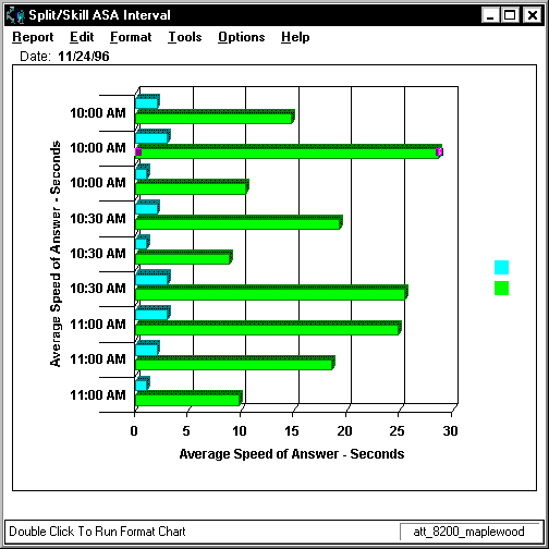
    In the first example, you can see that the report shows one row of data for the interval beginning at 10:00 AM, one row of data that includes information for each split/skill for the interval beginning at 10:30 AM, and one row of data for the interval beginning at 11:00 AM. In the second example, there is a row of data shown for each split/skill for each interval.

  14. Select Done.