AVAYA DOCUMENTATION CENTER
Find answers to your technical questions and learn how to use our products
Avaya CMS Supervisor Report Designer
What are charts?
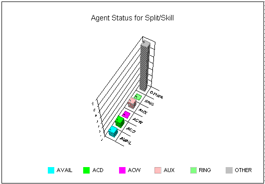
Charts provide a graphical representation of data. Values or data points are displayed in formats such as bars, lines, filled areas, and pie charts. These data points are grouped into series that are identified with unique colors. In many chart types, one data point from each series is grouped together by category across an axis. A chart can also have a title and a legend. Categories are plotted along the x-axis, values are plotted along the y-axis. A two-dimensional chart shows series next to each other, while a three-dimensional chart plots series along the z-axis.
Example
About the Chart Format Options window
The Chart Format Options window gives you access to the General, Axis, Data, Data Labels, Fonts, Series Labels, Legend, Title, Type, and 3D Effects tabs for formatting charts on reports.
Accessing the window
If the report you want to design includes a chart, you can format how the chart is displayed and what is displayed on the chart. Access the Chart Format Options window by doing any of the following tasks:
Double-click a chart in the report.
Select Chart from the Format menu.
Select Format Chart from the right mouse button pop-up menu.